Symmetry & Asymmetry
February 15, 2020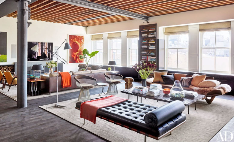
Beauty is in the eye of the beholder but design has certain principles that helps structure and build whatever we are seeing to create that beauty. One of them being Balance. Balance is used to illustrate the visual weight of something we are seeing. It can be used in every medium from photography to clothing. It can either unite or divide. Something a “good” design always has is balance and what it does is creates a sense of stability. The main two ways in a home to create balance is through Symmetry and Asymmetry. Notice how there is no versus. One is not better than the other but Asymmetry is a little bit more challenging to achieve but when it is mastered it is very exciting.
Symmetry is easy to spot because both sides look the same like a mirror image. There are plenty of games when we were kids that teach us about symmetry, it is basically engraved into our everyday lives very early. It helps that it is easy to distinguish if its right or wrong and how to fix it.
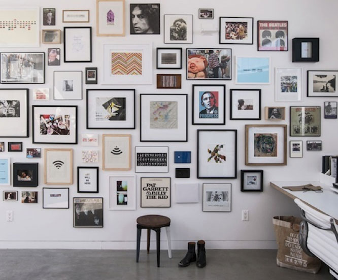
Asymmetry is using different items, often of different shapes, arranged in a certain way to achieve balance of visual weight. Things that make that more challenging are size, shape, color, and material. For example a black leather chair vs the same chair in a different fabric may visually appear less heavy. This art wall is a great example of balance. All the different colors of frames, content. The size of the frames the size of the content. Each frame has been placed very intentful.
Balance is sensual in that if ‘feels’ wrong or right. Getting it right can take lots of practice, experience, and often just trial and error. So get out there and experiment.
1 | 2 | 3 | 4